The MeriTalk brand communicates who we are, what we do, and how we deliver value to our customers. This guide will give you the direction you need to express our brand identity consistently across every touch point – in marketing communications or in person, online or in our product, and everywhere in between.
With our broad audience base, we must communicate a single, unified MeriTalk brand – one that looks, feels, and acts with consistency regardless of medium. Follow these guidelines to bring the MeriTalk brand to life for customers, prospects, partners, and employees alike.
The MeriTalk logo is the graphic representation of our company and brand. It displays the MeriTalk symbol and company name in a distinctive and proprietary form. Think of it as the official signature of our activities, products, and services.

Clear Space
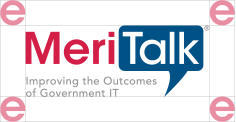
Maintaining proper surrounding clear space ensures that the logo isn’t crowded by other distracting graphic elements or typography. The minimum acceptable clear space is shown here. Keep all other text and graphic elements outside of this area. The light red “e” illustrates the required minimum clear space surrounding the logo.


Minimum Size
Although it can be reproduced in a variety of sizes, do not reduce the logo so small as to compromise its legibility and reproduction quality. Additionally – it is necessary at times to use the logo without the tagline text. If you cannot easily read the tagline text, use a version of the logo without the tagline.


One Color Version
The one color version of the logo has many uses, but it should only be used when the full color version cannot be used for legibility reasons. For instance, for collateral intended to be printed in black and white, or when the logo needs to be placed on a dark background.


Logo Lockup
At times when the logo needs to be presented with a partner logo, the preferred layout places the MeriTalk logo on the left, the partner logo on the right, and a thin gray line separating the two. The two logos should be scaled in such a manner that neither is bigger or smaller than the other. At times, partners will have strict guidelines as to how their logo appears with partner logos. In these cases, please follow the partner’s guidelines.


Hex: #d31145
RGB: 211, 17, 69
CMYK: 11, 100, 70, 2
Hex: #005188
RGB: 0, 82, 135
CMYK: 99, 73, 22, 6
Hex: #808080
RGB: 128, 128, 128
CMYK: 52, 43, 43, 8

Hex: #ffcc33
RGB: 255, 205, 52
CMYK: 0, 19, 89, 0
Hex: #0066cc
RGB: 0, 102, 204
CMYK: 86, 61, 0, 0
Hex: #40ae49
RGB: 64, 174, 73
CMYK: 75, 4, 100, 0
Hex: #8560a8
RGB: 133, 96, 168
CMYK: 54, 71, 0, 0
Hex: #f18c21
RGB: 241, 140, 33
CMYK: 2, 54, 100, 0

Fonts and typography play an important role in communicating an overall tone and quality to our audiences. Careful use of typography reinforces our personality and ensures clarity and harmony in all marketing and communication efforts.
Hero headlines are big and light
Open Sans in a Headline
Subheadings are a middle size, medium/bold weight, and all caps
SUBHEADINGS HELP CREATE CLARITY IN INFORMATION LAYOUT
Body copy is small, light (weight) where appropriate, and has exaggerated leading (line-height, roughly 1.5)
This example is large enought to use the lighter weight of the font Nulla vitae elit libero, a pharetra augue. Cum sociis natoque penatibus et magnis dis parturient montes, nascetur ridiculus mus. Sed posuere consectetur est at lobortis. Cum sociis natoque penatibus et magnis dis parturient montes, nascetur ridiculus mus. Etiam porta sem malesuada magna mollis euismod. Cum sociis natoque penatibus et magnis dis parturient montes, nascetur ridiculus mus. Etiam porta sem malesuada magna mollis euismod.
Smaller body copy may require using the normal weight for legibility
Small text is easier to read in the normal font weight Maecenas faucibus mollis interdum. Vestibulum id ligula porta felis euismod semper. Cras matti consectetur purus sit amet fermentum. Morbi leo risus, porta ac consectetur ac, vestibulum at eros.
Rockwell is to be used for block quotes and sidebar titles only
“The whole problem with the world is that fools and fanatics are always so certain of themselves, and wiser people so full of doubts.”
– Bertrand Russell (1872-1970)
