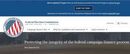
The Federal Election Commission launched its new website in order to make campaign finance data more user-friendly.
The website includes all open-sourced data for the first time in the agency’s history. The website was built from scratch by FEC employees and 18F.
FEC employees who’ve been working with campaign finance data for most of their careers were used to the way the old site was set up, but constituents who were curious about campaign finance data were having a difficult time finding the information that they needed. 18F partnered with the FEC to make the data more user-friendly. Instead of having 20 tabs on the home page, the FEC provides three categories: campaign finance data, help for candidates and committees, and legal resources.
The website is completely mobile-friendly, which is one of the aspects that some Federal websites are still lacking. Forty-one percent of the most popular Federal websites were not mobile-friendly in March, according to a study by the Information Technology Innovation Foundation.
 “If you don’t go mobile, you lose a lot of users,” said Wei Luo, deputy CIO of Enterprise Architecture at the FEC. “As far as design concerns, it’s not as easy as it sounds.”
Luo said that making the site mobile-friendly wasn’t as simple as adjusting the size of the screen. The agency had to prioritize the content that it wanted to present on the site in order to make the website usable on a mobile screen.
The website is API driven and all of the code is located on GitHub. The FEC launched the Beta version of its site in October 2015 and the agency is continuing to garner user feedback to make improvements. The old version of the website is still available for users who can’t find what they’re looking for on the new version. Luo said that the final website could end up looking completely different depending on how users react.
“It’s a lot of risk-taking,” Luo said. “We need something not complete so people can tell us how to improve.”
Luo used Google Analytics to determine how many people were still visiting the old site and to find out what they were looking for. About 70 percent of people were consistently using the new site and 20 percent were consistently using the old site. Luo determined that the people using the old site were looking for data involving individual contributions to campaigns. Luo is considering adding a link to individual contributions on the home page.
“It’s important to have conversations with users with different perspectives,” Luo said. “If we make a mistake, we make a mistake together.”
Luo said that he wasn’t nervous about the launch of the new site because the team had spent plenty of time consulting users about the changes.
Users can also provide their comments by clicking on the feedback tab on the bottom right corner of every page. The feedback will be made public on GitHub and the FEC staff attempts to answer every comment or link to a previous answer if the question has already been asked.
The FEC houses campaign finance data dating to the 1970s. On the new site, users can easily search their ZIP code to find out more about the candidates in their area and where their money is coming from.
The FEC also converted its comprehensive book of campaign finance rules into Web pages, to make the regulations more searchable. The FEC’s calendar events and news announcements also have their own links on the home page.
“We’ve been working really hard to make the data more findable for folks,” said Amy Kort, performance manager for the Office of the CIO at the FEC.
